Guides
Create a product comparison guide that helps Instagram shoppers choose

Compare a small product range using the same meaningful criteria, show what is included and label missing facts. Add the shopper’s constraints so the guide can lead to a suitable shortlist, a question or a decision not to buy.
Published by ReplyMagnet · Last updated
“What is the difference between these?” is a buying question that a product photograph rarely answers completely. A shopper may need to compare dimensions, what comes in the package and what they must arrange separately before a product becomes useful. A concise comparison resource puts those differences in one place.
This guide builds an example for a fictional ceramic planter range. You can adapt the blank worksheet without providing contact details. The examples are not products sold by ReplyMagnet, verified customer specifications or evidence of sales results.
When is a product comparison guide useful?
Use a comparison guide when shoppers are choosing among a few genuinely comparable options and need to inspect their differences together. Use a focused answer or product finder when the task is different.
A comparison guide is a customer-facing resource that places products against shared criteria. It can be a web page or a short document. Its job is to make the decision legible, including the reasons an option may not suit the reader.
A repeated question about one item may need an FAQ. A shopper who needs help identifying the relevant product category may benefit from a simple product finder. Someone already choosing between two options needs their meaningful differences, rather than another sequence of introductory questions.
Shopify's comparison-table guidance describes placing product options alongside important shared attributes. Apply that structure to the decision your customers face. A longer list of features is not automatically a better comparison.
How do you choose fair comparison criteria?
Choose criteria that can change the shopper’s decision, define them consistently and use the same units for each option. Record a source for every factual entry before publishing.
Start with the questions a buyer must resolve: Will it fit the space? What comes with it? What else will I need? Where can I check the current price? Those questions provide a stronger structure than rows selected solely to make the most expensive option look impressive.
Write a definition beside each working row. “Width” could mean the outside width, opening width or usable inside space. Those measurements answer different questions. If one product record supplies an outside measurement and another supplies an opening measurement, do not put them under a shared “width” heading.
Use the same unit and measurement basis. Convert units only when the underlying measurement is known, and show sensible precision. A converted number with many decimal places can look more certain than the original specification warrants.
Maintain a small seller-side evidence record: criterion, definition, product, value, source, date checked and unresolved question. That record supports the public guide, but the shopper does not need to inspect your entire internal spreadsheet. They need understandable facts and a way to verify material details.
What does a useful side-by-side comparison look like?
A useful comparison shows the same criteria for each option, distinguishes verified absence from missing information and keeps the current purchase details easy to find.
The table below is deliberately fictional. Compact, Deep and Hanging are teaching labels, not actual product models. Their dimensions illustrate a consistent comparison format; they are not recommendations for particular plants, pots or mounting arrangements.
Notice the row labels. Opening width and inside depth are separate measurements. Neither establishes that an existing plant pot will fit: shape, clearances and the seller's fit guidance may also matter. The guide should make those remaining checks visible rather than convert two numbers into a compatibility guarantee.
Fictional planter comparison. All values are invented to demonstrate the format; check real specifications before making a purchase.
Criterion
Opening width
- Compact
- 12 cm
- Deep
- 16 cm
- Hanging
- 12 cm
Criterion
Inside depth
- Compact
- 10 cm
- Deep
- 18 cm
- Hanging
- 10 cm
Criterion
Drainage opening
- Compact
- Present
- Deep
- Present
- Hanging
- Not verified
Criterion
Included components
- Compact
- Planter and saucer
- Deep
- Planter only
- Hanging
- Planter and cord
Criterion
Extra to investigate
- Compact
- None identified in this example
- Deep
- Suitable saucer if needed
- Hanging
- Mounting arrangement and documented limits
Criterion
Price and stock
- Compact
- Current product page
- Deep
- Current product page
- Hanging
- Current product page
“Not verified” means the source has not established the answer. It must not become “no drainage opening” simply because an empty cell looks untidy. “Absent” should describe a confirmed absence. “Not applicable” belongs only where a criterion genuinely does not apply, not where the information is inconvenient to obtain.
Avoid generic ticks when the underlying difference needs words. A tick beside “accessories” would hide that one option includes a saucer and another includes a cord. Name the component. If every option has the same fact, consider whether the row needs prominence at all.
The Hanging option remains incomplete until its relevant documentation is available. A shop can publish that limitation honestly, but it should not recommend a mounting setup or invent a load limit. Where a missing fact is essential to safe or suitable use, resolve it before promoting that use.
How should shoppers apply their own requirements?
Ask shoppers to identify their non-negotiable constraints before choosing. An attractive feature does not compensate for a requirement the product cannot meet.
Consider two invented shoppers. The first wants to place an existing pot inside a planter. They know the pot's outer dimensions and the available shelf space. Opening width is a starting point, but the table does not state every clearance or shape condition needed for fit.
Their next action is to compare those requirements with the seller's documented inner dimensions and fit instructions, or ask a specific question if that information is missing. Selecting Compact because “12 cm sounds close” would substitute a guess for the missing check.
The second shopper wants a planter that rests on a surface and does not want to arrange mounting. Hanging is a mismatch for that stated requirement even if its shape is appealing. They can compare Compact and Deep, then investigate whether they need the separate saucer listed for Deep.
Neither example needs a numerical score. A mandatory constraint should not disappear inside an average of unrelated benefits. The guide can leave two options on a shortlist or show that none fits. Helping a shopper recognize a mismatch is useful work.
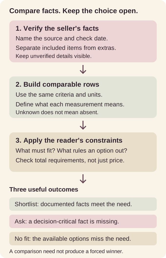
Original explanatory diagram. A comparison organizes evidence; it does not establish compatibility, safety or a purchasing outcome.
What should the copyable comparison worksheet contain?
Include the reader’s use, essential constraints, comparable facts, unknowns and a reasoned next action. Keep personal notes separate from information the business needs to collect.
Copy the worksheet below into a document or notebook. The public product comparison provides the evidence; these fields help a shopper apply that evidence to their own decision.
My intended use: Describe the situation in one sentence. For example, “I want a planter to hold my existing pot on a narrow shelf.” Avoid starting with a product name when the requirement has not yet been established.
Must-fit conditions: Record the dimensions, included components or practical arrangements that determine whether an option is possible. Identify which measurements you know and which still need checking. Do not enter private information that is irrelevant to the choice.
Options to compare: List a small set from the same useful category. Beside each, record the current product-page address and the date you checked it.
Shared criteria: Use the same definitions and units for every option. Copy the relevant facts, then mark any unknown, confirmed absence or genuinely inapplicable criterion explicitly.
Included and additional items: Name what arrives in the package and what else you may need to obtain or arrange. Keep an unresolved requirement visible instead of assuming that an accessory is included.
Question still blocking the decision: Write the missing fact precisely. “What is the usable inside width at the depth where my pot will sit?” is more actionable than “Will this work?”
Next action and reason: Choose a shortlist, ask the question, inspect current purchase details or conclude that none fits. Explain which requirement drove that action. The worksheet is complete when it produces a useful next step, even if that step is further investigation.
The shop does not need to collect the completed worksheet to make the resource valuable. Keep optional feedback or a separate signup distinct from these personal notes. For general worksheet layout, the worksheet design guide explains how to connect fields to a useful output.
How do you compare what the shopper actually needs to buy?
Separate the item price from required extras and delivery, and compare totals only when the assumptions match. Keep unknown costs visible rather than presenting an incomplete total.
Two listed prices may cover different packages. In the fictional range, Compact includes a saucer and Deep does not. That difference matters to a shopper who needs one, but the comparison should not invent an accessory price to force a tidy result.
Use a short cost note: current item price; required extras for this use; delivery to the intended destination; other applicable charges shown by the seller; and any unresolved amount. Record currency and the basis of the quoted figures. A collection price and a delivered price describe different situations.
If an extra is optional, label it optional rather than quietly adding it to one option and leaving it out of another. If the required item has not been identified, the total is incomplete. Write that plainly and provide the next check.
Avoid promising a universal saving or return on purchase. A lower listed price may suit one shopper, while another values an included component or a different format. Explain the tradeoff using facts. The sales-objection guide covers answering a price concern without inventing value.
How do you make the comparison readable on a phone?
Keep meaningful row and column labels, readable text and a text-based version of important information. A screenshot of a wide spreadsheet should not be the only comparison available.
Test the resource at the size a shopper will actually use. If the table requires repeated zooming and guessing which header belongs to a value, change the layout. Per-option cards can work when they repeat the same criteria in the same order.
W3C's tables tutorial explains that data tables need relationships between headers and data cells, with captions identifying the topic. Preserve that structure in a web table. A visually tidy export does not prove that a document retained its reading structure.
Use links such as “Check Compact specifications and current price” rather than repeated “Click here” labels. W3C's writing guidance supports meaningful links and clear instructions. The accessible lead-magnet guide provides broader authoring checks.
How can you deliver the guide through Instagram?
Offer the prepared comparison through a supported request-and-delivery campaign. Explain what the resource contains, then let the current product pages handle purchase information.
An illustrative caption is: “Choosing between our planter formats? Comment COMPARE for a guide to dimensions, included components and the checks to make before deciding.” Use that wording only when the real resource supports the promise.
A matching DM could say: “Here is the planter comparison guide. It explains the differences and links to current product details. If a required measurement is missing, ask us before choosing.” This is invented copy, not a screenshot or a customer interaction.
ReplyMagnet can deliver a prepared PDF or an external link through a configured eligible request. Its asset documentation places PDF assets on Starter and external link assets on Basic and above. Check the ongoing plan for the format you intend to use; a trial is a separate temporary entitlement.
The campaign does not create the product specifications or synchronize a live catalogue. It does not reserve stock, confirm fit or prove a purchase occurred. One campaign's keyword variants deliver its attached resource, rather than selecting different products automatically.
A branching conversation is unnecessary for a single comparison guide. Start with the comment-to-DM setup guide once the resource is ready. If your actual delivery requires contact capture, explain that requirement before the request instead of advertising an unexplained extra step.
How do you check the guide before sharing it?
Ask a person to use the comparison for a realistic choice and an unresolved question, then correct the facts or layout that prevented the task. Recheck changing product details at their source.
Use a neutral task: “You want a surface planter and already have a pot. Show what you would check before choosing.” Do not tell the person which row to read or which option should win. A second task can ask what they would do when a necessary dimension is missing.
GOV.UK's moderated testing guidance recommends observing relevant tasks with clear, neutral instructions. Apply that principle to this small resource. These are proposed tests; no participant session or successful outcome is claimed here.
Check whether the reader can distinguish included components, unknown facts and current purchase information. If you have to explain a label repeatedly, improve the label. If the answer is absent, improve the evidence rather than adding persuasive copy around the gap.
Assign someone to update material changes in the range and recheck the linked pages. A downloaded copy can outlast a product update, so show its checked date and direct readers to current details. Replacing a campaign asset affects future deliveries; do not promise that it rewrites resources already received.
The finished guide should help a shopper explain their next action. “These two fit my stated requirements,” “I need one more measurement,” and “None fits” are all legitimate conclusions. That clarity is the resource's purpose.
Common questions
How many products should a comparison guide include?
Start with the smallest set that represents a real buying decision. Three options work for this fictional example; use separate guides when the products require substantially different criteria.
Should the comparison be a PDF or a web page?
Choose by reading and maintenance needs. A PDF can be saved, while a maintained page can present current information. Test the actual phone experience and keep changing purchase details easy to verify.
Can the guide name a best product?
Name a fit for an explicit situation only when the evidence supports it. Avoid a universal winner or a recommendation that depends on missing compatibility information.
Does requesting the guide count as a sale or qualified lead?
A request shows interest in the resource. A sale requires a purchase record, and qualification needs separately defined evidence. Keep those events distinct.
Do I need a chat flow builder to share a comparison?
No. A single prepared resource can use a supported request-and-delivery campaign. Use a branching flow only when the conversation has a separate useful job.