Guides
Make the resource readable after someone opens it
A resource can look polished in a desktop design preview and become difficult to use on a phone. Small text is one problem. A reading order that jumps between columns, an unexplained diagram or a link called “here” can make the same document confusing in different ways.
Published by ReplyMagnet · Last updated
The short answer
Treat accessibility as part of authoring the resource, not a final visual inspection. Build a logical structure, preserve it during export and test the actual delivered file. A quick review can find problems; it does not certify compliance.
Start freeFollow one reader through the broken page
Begin with the task someone needs to complete, then check whether the file communicates that task in a usable order.
Consider an illustrative equipment checklist for a beginner sketching workshop. The original PDF has two columns. The left column lists what to bring; the right column explains which materials the studio supplies. A decorative arrow points from “paper” to a small note at the bottom. The designer can understand the composition immediately because they already know the answer.
A new reader does not have that advantage. On a phone, they zoom into the left column and miss the note. A screen reader might encounter text in an unexpected sequence if the document's reading order is wrong. Someone scanning for whether to buy paper must reconstruct the relationship between several pieces of content.
The task is simple: decide what to bring. Rewrite the page around that task before adjusting its colors or type size. Put “Bring a pencil” under one heading, “Paper is provided” under another, and the optional materials under a third. The reader should not need to infer essential instructions from position or an arrow.
This example is fictional, but the underlying PDF issue is documented. W3C's PDF reading-order technique describes checking that content is presented in the correct order, including with assistive technology. A file can have a pleasing visual order while its underlying structure communicates something else.
The lead-magnet delivery guide covers getting the resource to the reader. This article starts at the next moment: the file is open, and the person needs to use it.

Editorial illustration, not a product screenshot.
Try the resource flow for 30 days with 1,000 engagements. No card required.
Start freeGive the document a structure before styling it
Use real headings, logical reading order and descriptive links instead of relying on appearance alone.
Write the resource as an outline first. For the workshop checklist, the outline is “What to bring,” “What we provide,” and “Optional extras.” Each heading introduces a distinct group of instructions. The title identifies the document, while section headings describe the questions the reader is likely to have.
Apply the document editor's actual heading structure where available. Making a paragraph large and bold may make it look like a heading without giving it the corresponding structural meaning. Check what survives when you export. A correct source document can still produce an unsuitable final file if the export settings or editing workflow discard structure.
For a PDF, verify tagging and reading order in an appropriate authoring or inspection tool. Tool-specific steps vary, so do not assume that a single export checkbox fixes every document. The point is to confirm the result, not merely to remember that an accessibility option was selected.
Links should name their destination or purpose. “Workshop materials page” helps someone decide whether to follow it. “Click here” asks them to rely on surrounding context. W3C's writing guidance supports meaningful link text, clear instructions and headings that communicate the organization of content.
Keep the same names across the caption, message and resource. If the offer promises a materials checklist, the file should not open with an unexplained title such as “Your creative journey.” Consistent naming reduces the work of confirming that the right resource has arrived. It also makes support questions easier to identify without asking people to describe a file by its cover color.
Decide what every image contributes
Describe the information an image communicates, and keep essential instructions available as text.
A photograph of pencils may establish mood but add no instruction. A diagram showing which end of a tool to use carries information. These images need different treatment. W3C's image tutorial explains that appropriate text alternatives depend on the purpose of the image in its context.
For the workshop checklist, a decorative sketch beside the title does not need a lengthy explanation of every line. A comparison of required and optional materials needs the same distinction available in text. Write “Required: one pencil. Optional: an eraser” in the document rather than asking an image description to carry the entire resource.
Avoid exporting a whole page of text as one flat image. That can remove useful structure and makes text harder to adapt. A worksheet should not depend on readers zooming into a picture of tiny instructions. Keep instructions as real text and check that they remain selectable and understandable in the final file; selectable text alone is not proof that the document is accessible.
When a diagram has several relationships, explain the important conclusion nearby. For example: “Start with the materials you already own. Buy optional items only if you want to try the extra exercise.” A short alternative can identify the diagram while the adjacent explanation carries the full reasoning.
Do not rely only on color to distinguish categories. Label required and optional items directly. Color may reinforce the distinction, but the meaning should survive a monochrome printout and a text reading. This is also useful editorial discipline: if you cannot explain a diagram without saying “the green part,” its labels may need more work.
Simplify the table before shrinking the type
Keep comparisons narrow enough to understand, and split unrelated information into separate sections.
Designers often solve a crowded page by reducing the font size. First ask whether all of the information belongs in the same table. Our illustrative checklist initially has columns for item, brand, size, supplier, price, who brings it and substitute. A beginner needs only the item, responsibility and optional note to prepare for class.
Move purchasing advice into a separate section if it is genuinely necessary. Remove suggested brands when any suitable item will do. The shorter comparison is easier to read because the decision itself has become simpler, not because the design has found a clever way to fit seven columns onto a phone.
Where a table remains useful, give it meaningful headers and preserve the relationship between each value and its header. Review the exported structure with tools suitable for the document format. A visually aligned row of text boxes is not necessarily a properly structured table.
For worksheets, provide enough room and clear instructions for the intended mode of use. A printable sheet and a form someone completes digitally are different artifacts. Do not describe a blank PDF as digitally fillable unless the fields actually work that way. If the sheet is intended for printing, say so before someone tries to type into it on their phone.
The revised workshop resource becomes a short, single-column checklist with three headings. This is an editorial choice for this small task, not a claim that every accessible document must use one column. More complex documents can be accessible, but their structure and testing need corresponding care.
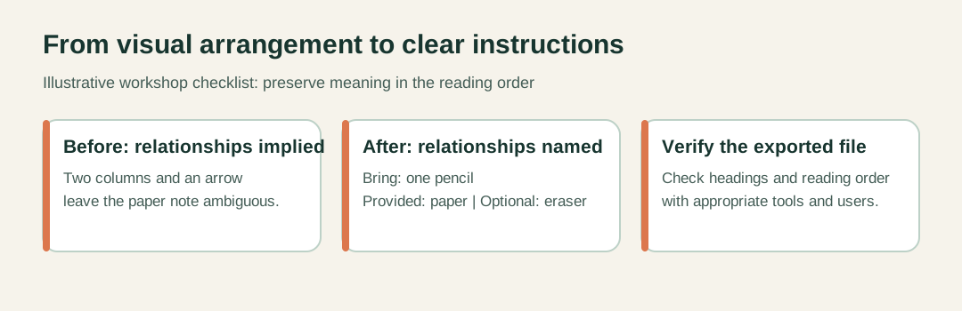
Conceptual document revision, not a screenshot or an accessibility certification.
Test the file that readers will actually receive
Check the exported resource on a phone and with appropriate assistive technology, then record concrete failures and fixes.
Start with the delivered file rather than the design preview. Open the same asset a reader would receive and complete the intended task. For this example, the test question is “What must you bring to the workshop?” A successful answer should not require guessing which note applies to which item.
On a phone, inspect ordinary reading and zoomed reading. Check whether text becomes difficult to follow, whether an important note sits outside the area a person is likely to inspect, and whether links can be identified and used. Record the device and viewing application because behavior can vary across readers.
Next, inspect reading order with a screen reader or other appropriate assistive technology and a suitable PDF checking workflow. Listen to whether the title, headings, items and notes appear in a meaningful sequence. A generic read-aloud function can reveal some sequence problems, but it is not a substitute for every screen-reader or keyboard check.
If the document includes interactive fields, test focus order, labels and completion with the relevant input methods. Check that a person can identify what each field asks for without relying on a visual cue alone. Ask someone with the relevant access needs to use the resource when possible, and treat their time and feedback respectfully.
Use a small issue log: location, observed problem, impact on the task, proposed correction and retest result. “Page one is inaccessible” is too vague to fix. “The supplied-materials note is announced before its heading, making responsibility unclear” points to a specific change. After correcting the source, export again and repeat the affected checks. Keep the tested final file distinct from earlier drafts.
Offer an alternative that carries the whole task
A web version can help when it is usable and equivalent; a bare summary is not an adequate substitute for missing instructions.
Some readers will prefer a web page. Others need a file they can keep or print. If you offer both, make the relationship clear and keep essential instructions consistent. A web alternative should contain the information required to do the task, including meaningful descriptions of diagrams and relevant links.
A web page is not automatically accessible simply because it is not a PDF. Its headings, links, images and interactive elements still need attention. W3C's page-structure guidance explains why logical structure supports navigation and understanding. Choose a format your team can maintain and test.
For ReplyMagnet delivery, review the current Assets documentation for supported asset types and plan eligibility before promising an external-link resource. The delivery tool does not repair an inaccessible document. Uploading a new version is also a separate operational step from correcting the source file.
Finally, distinguish a practical improvement review from a formal compliance claim. The checks here can reveal common problems, but they do not establish WCAG or PDF/UA conformance. If your organization needs a formal assessment, define the applicable requirements and use qualified testing. For an ordinary creator resource, the immediate work is still concrete: remove a confusing dependency, preserve the document's structure, test the final export and make the useful answer easier to reach.