Guides
Build a resource hub around the task people came to do
A resource hub should help someone choose the right next item without opening every file. Organize the page around what people want to do, describe the difference between similar resources and make access requirements visible before the click.
Published by ReplyMagnet · Last updated
The hub’s job is to help a visitor choose
Design the public page for finding a useful resource. Keep internal asset management and detailed answer content in their own places.

Generated editorial illustration of browsing a collection. It is not a live resource hub or a ReplyMagnet interface.
A fictional printmaking educator has six resources scattered across Instagram posts: an introduction to class formats, a materials list, a studio-visit checklist, a first-exercise guide, a troubleshooting note and workshop dates. Each can be useful, but a page listing six filenames does not explain which one a visitor needs.
The educator’s public hub needs to answer “Where should I start?” A person comparing class formats has a different task from someone preparing for a booked session. Grouping both items under “PDFs” describes the file type while hiding the reason to open them.
This is an invented information-design example. It is not a live resource hub, an observed user study or a description of a native ReplyMagnet website feature. Build the public page on an external site you can maintain.
The resource library audit guide covers internal decisions about keeping and updating assets. A hub presents the useful part of that collection to the reader. An FAQ answers particular recurring questions; a hub helps people navigate between resources that may each contain several answers or tasks.
Before drawing the page, list the situations that bring people to it. Use actual enquiries where available, and label assumptions as assumptions. The page’s structure should serve those situations rather than reproduce the folders on your computer.
Group by decisions a visitor recognizes
Use a small number of task groups that distinguish the resources. File format and internal campaign name can be supporting information, but should not carry the navigation alone.
For the fictional educator, three groups make sense: “Choose a session,” “Prepare to attend” and “Start practicing.” Each describes work the reader can recognize without knowing the business’s internal terminology.
Do not make the groups broader than the collection warrants. “Learn,” “Grow” and “Discover” might all sound welcoming while leaving the visitor unable to predict where a materials list belongs. A useful label narrows the choice.
Check the boundary between neighboring groups. The class-format introduction belongs with choosing a session. The studio-visit checklist belongs with preparing to attend. A resource may be relevant to more than one situation, but duplicating it across every group can make the collection seem larger and harder to understand.
Where a resource serves two tasks, use a short cross-reference or one primary location with a clear description. Keep one maintained destination for the item rather than separate copies that can drift apart.
W3C’s page-structure guidance explains how meaningful headings and regions support navigation. Use real section headings in the external page, not text that merely looks like a heading. A visitor using assistive technology should be able to understand the same grouping as someone scanning visually.
The hub need not show everything the business has ever published. Include items with a clear current purpose. Historical resources can have a separate home if there is a real reason to retain them publicly.
A six-resource hub with visible differences
Give every resource a task-focused title, a short description and the relevant access condition. The fictional wireframe below shows how six items can serve three situations.
The proposed page opens with: “Find the resource for your next printmaking step.” A short introduction says that the page contains class information, preparation resources and introductory practice material. It does not claim to replace the event’s authoritative registration or booking record.
Each item has one main link. The description tells the visitor what they will be able to understand or do after opening it. A format note can follow, especially when it affects use, such as a printable checklist or a page containing a video.
The access examples in the table are invented page-design choices. Before using them for real resources, verify the actual requirements. Do not describe something as immediately available if it opens a signup, payment or account-access step.
In this example, workshop dates are maintained on the registration site rather than copied into the hub. The hub names that destination so the visitor knows they are moving to a separate process. The page does not imply that clicking a resource reserves a place.
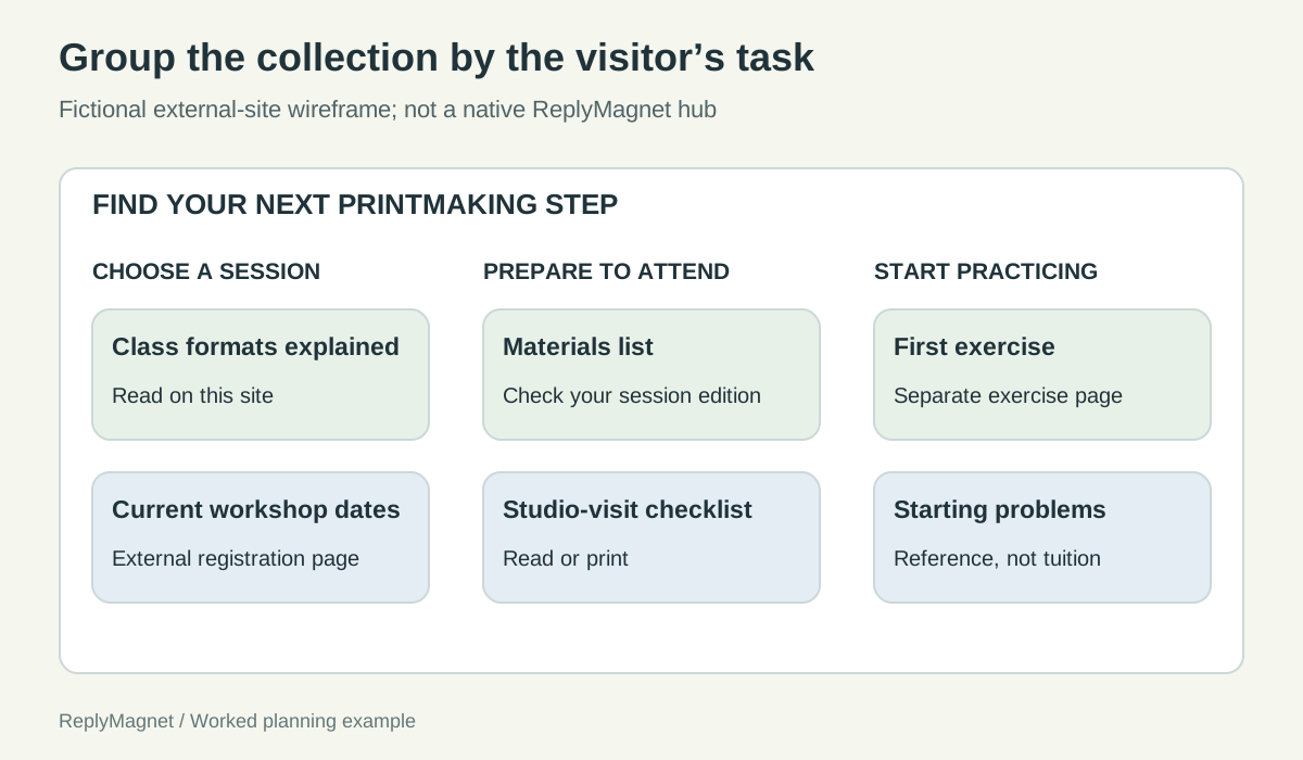
Original public-hub wireframe. These are fictional resources and access arrangements; the full table supplies their descriptions.
Fictional six-resource hub. Resource names and access arrangements are instructional examples, not live offers.
Task group
Choose a session
- Resource and purpose
- Class formats explained: compare the types of teaching offered
- Visible access note
- Read on this site
Task group
Choose a session
- Resource and purpose
- Current workshop dates: inspect the organizer’s current options
- Visible access note
- Opens the external registration page
Task group
Prepare to attend
- Resource and purpose
- Materials list: see what the actual session requires
- Visible access note
- Printable list; verify your session edition
Task group
Prepare to attend
- Resource and purpose
- Studio-visit checklist: prepare practical questions before travelling
- Visible access note
- Read or print; no signup in this example
Task group
Start practicing
- Resource and purpose
- First exercise: understand one introductory task
- Visible access note
- Opens a separate exercise page
Task group
Start practicing
- Resource and purpose
- Common starting problems: locate the relevant clarification
- Visible access note
- Short reference note; not individual tuition
Write descriptions that help someone reject the wrong item
Explain the scope and important limits of each resource. A useful description lets a reader recognize that an item is not the one they need.
“Our essential guide” tells the visitor how the creator feels about the resource. “Compare the class formats before choosing a session” tells them what it does. The second description can support a decision even when the reader chooses not to open it.
For similar resources, state the difference explicitly. A materials list identifies requirements; a studio-visit checklist covers practical preparation. If both descriptions say “Everything you need before attending,” the titles and page grouping cannot fully repair the overlap.
Avoid vague links such as “More” repeated six times. W3C’s writing guidance recommends descriptive links and clear instructions. The destination title can often serve as the link text, with a short explanatory sentence beneath it.
Keep changeable details at their authoritative destination where practical. If workshop dates change frequently, a description can say “See current dates and registration details” instead of repeating dates in several places. The link still needs regular checking, and the destination must make the current status clear.
Show access conditions beside the item. A visitor may be willing to sign up for a newsletter, but that should be an informed choice rather than an unexpected barrier after a “Download now” promise. Likewise, distinguish a free preview from a purchased product’s access route.
Do not overload each entry with promotional language. The hub’s descriptions are navigation aids. Detailed persuasion and complete instructions belong on the appropriate destination, where the reader has chosen to learn more.
Use three finding tasks to test the page
Ask a willing reviewer to locate resources for different situations without naming the correct labels in the task. Observe both where they go and what they expect to find.
For the fictional collection, use three tasks:
Task one: “You are considering your first session and want to understand the available teaching formats. Find the information you would use before deciding.”
Task two: “You have a confirmed place and need to check what to bring. Show where you would look, and explain how you would know the list applies to your session.”
Task three: “You have an introductory exercise but are unsure about one of its instructions. Find a useful clarification or the appropriate next route.”
These tasks name the situation, not the button. Telling the reviewer to click “Materials list” would test instruction following rather than whether the page helps them find it.
Record the first group they choose, any item they confuse with another, the access condition they expect and what they believe the destination contains. A click on the intended link is incomplete evidence if the reader expects a different resource.
GOV.UK’s moderated usability guidance supports observing people attempting realistic tasks. A small informal review can reveal navigation problems, but it does not establish a universal success rate.
If reviewers repeatedly open two resources to discover which one fits, improve the descriptions or grouping. If the problem appears only after opening the correct item, the destination may need revision. Keep the hub’s findability problem separate from the resource’s instructional problem.
Run the task at an ordinary phone viewing size. Check that descriptions remain visible, links are usable and important access notes are not hidden behind decorative cards or hover effects.
Link each campaign to the most relevant destination
A campaign promising one resource should normally take the reader to that resource or its clearly explained access step. Use the full hub when the reader genuinely needs to choose among items.
Do not make every campaign land on the hub merely because the hub exists. Someone who requested the materials list should not have to identify it again among six items. A direct destination preserves the promise and reduces unnecessary searching.
The hub is useful from a profile or a general “browse resources” invitation, where the reader has not yet chosen an item. It can also provide a related-resource route after the requested task is complete. Keep that secondary browsing invitation separate from the main action.
ReplyMagnet can use external-link assets under the relevant plan eligibility; the asset documentation explains the current capability. It does not host a native customizable resource hub. Maintain the external site and check its destination behavior as part of your publishing process.
Give the hub an owner and a review trigger. A resource being replaced, a class format changing or a destination closing should lead to a review of the title, description and access note. The internal audit can identify the change; the public hub must communicate it accurately.
The lead magnet ideas guide helps when the collection lacks a resource for an important task. Do not fill every visual slot simply to make the page look complete. A small collection with clear distinctions is useful when people can find the right item and understand what will happen next.