Guides
Plan an Instagram carousel that teaches a real decision
A carousel can be easy to swipe through and still leave the reader unable to decide anything. The missing element is often an argument: a sequence that connects a question, relevant information and a useful conclusion.
Published by ReplyMagnet · Last updated
The short answer
Choose one reader decision, outline the reasoning before designing slides and include the evidence that changes the answer. The eight-panel example below is a teaching design, not an ideal slide count or a promise of better reach.
Start freeChoose the decision before choosing a cover
Define what the reader should be better able to judge after the final panel.
A fictional community ceramics studio wants an educational carousel for people considering their first workshop. “Five reasons to try pottery” would describe benefits, but the studio keeps receiving a more practical question: should a beginner choose a hand-building session or a wheel introduction?
That decision gives the carousel a purpose. By the end, a reader should understand enough about the two formats to identify which experience better matches what they want to try. The post does not need to convince everyone to book. It needs to make the distinction useful.
Write the question in the reader's language. “Which beginner pottery workshop should I choose?” is clearer than “Discover your creative pathway.” The second phrase can fit almost any activity. The first names a decision that the rest of the content can answer.
Define the scope before gathering images. In this fictional example, both sessions welcome beginners. The carousel compares the activity and session structure, not medical suitability, accessibility accommodations or live availability. Those details require their own verified information and a clear route to ask the studio.
The lead-magnet ideas guide can help identify an optional planning sheet, but the carousel should answer its own question. A resource may extend the decision; it should not be required to discover the basic distinction promised on the cover.
Editorial illustration, not a product screenshot.
Try the resource flow for 30 days with 1,000 engagements. No card required.
Start freeBuild the argument in plain text
Draft the sequence as a short explanation before dividing it into panels.
The studio writes the argument in a paragraph. Hand-building introduces shaping clay with hands and simple tools. A wheel introduction focuses on working with clay on a rotating wheel. A person who wants to explore forms at their own pace may prefer the first fictional session; someone specifically curious about the wheel may prefer the second. The actual session descriptions, support and inclusions must be checked before booking.
This paragraph reveals what evidence the carousel needs. It needs a clear view of what happens in each session, a fair comparison and a boundary around what the reader cannot infer. It does not need a dramatic claim that one format is easier, more therapeutic or more likely to produce a perfect object.
Next, separate the reasoning into steps. Establish the choice, explain option one, explain option two, compare the activity, show how a preference changes the choice, state the remaining checks and offer a practical next action. Only then decide how many panels are needed.
Eight panels work for the example below because they provide room for two explanations, a comparison and a limit. Another lesson might need fewer or more. There is no platform-performance claim attached to this number. Adding panels to satisfy a supposed formula can weaken the explanation just as much as cutting a necessary qualification.
Use a paper outline or simple text document at this stage. If the argument does not make sense without gradients and photographs, the design is unlikely to repair it. Clear headings and concise language, supported by W3C's writing guidance, are useful starting points.
The eight-panel storyboard
Give each panel a specific teaching job and remove panels that merely repeat the preceding point.
Panel 1: name the choice. Copy: “Your first pottery workshop: hand-building or wheel?” Visual: two clearly labeled activity images. Purpose: identify the decision without claiming that one option is universally better.
Panel 2: explain hand-building. Copy: “In this session, you shape clay with your hands and simple tools.” Visual: a close view of the activity. Purpose: replace an unfamiliar category name with an observable action. The wording must match the studio's actual offering before use.
Panel 3: explain the wheel introduction. Copy: “In this session, you practice shaping clay on a rotating wheel with an instructor.” Visual: a relevant demonstration. Purpose: describe the alternative at the same level of detail, rather than making one option sound more impressive through richer copy.
Panel 4: compare the experience. Copy: “Choose by the process you want to try, not by a promise of a perfect finished piece.” Visual: a small comparison of the two activities. Purpose: shift attention to the decision criterion. This is the studio's editorial recommendation, not a universal statement about all workshops.
Panel 5: work through one preference. Copy: “Want to explore a shape with your hands? Start by reading the hand-building session details.” Visual: a labeled example of the process. Purpose: show how a preference leads to a next check without guaranteeing a particular result.
Panel 6: work through another preference. Copy: “Curious specifically about using a wheel? Read what the wheel introduction includes.” Visual: the relevant equipment and activity. Purpose: provide a parallel reasoning path, not a second sales pitch.
Panel 7: state what still needs checking. Copy: “Before booking, check duration, materials, collection arrangements and any support you need.” Visual: a short labeled checklist. Purpose: prevent the simplified comparison from masquerading as a complete booking answer.
Panel 8: offer the next useful action. Copy: “Save these questions for your booking decision. If you want a place to compare sessions, our workshop checklist has a blank column for each option.” Visual: an honest preview of the checklist's structure. Purpose: extend the task with an optional artifact rather than withholding the answer.
All session details here are illustrative. A real studio must replace them with verified information. The storyboard demonstrates sequence and editorial purpose; it is not ready-made factual copy for an unrelated business.
Use evidence where it changes the choice
Show the relevant activity or fact, and distinguish illustrative visuals from proof of a real offering.
A photo of an attractive finished bowl may catch attention, but it does not explain what a beginner does during the session. A clear view of the activity can be more useful evidence for this particular decision. Ask what uncertainty each visual resolves before choosing it.
If you show actual workshop photographs, ensure they represent the session being described and that you have appropriate permission to use them. Do not present generated imagery as proof of the studio's facilities, instructor support or participant results. An illustration can explain a concept, but it should not impersonate documentary evidence.
The same rule applies to numbers. If a panel says a session lasts two hours, verify that fact against the current offering. If the duration varies, explain the variation or direct readers to the specific session page. A simplified graphic should not freeze changing information into an apparently universal claim.
Avoid generic authority decoration. A statistic about social-media attention would not help someone choose a pottery session. Include sources and facts because they support the reader's decision, not because a number makes the post look researched.
Google's helpful-content guidance emphasizes useful, reliable content and clear value for readers. It is a search-content source, not evidence about carousel distribution. Here the transferable editorial discipline is to provide substantive help rather than a thin summary dressed as expertise.
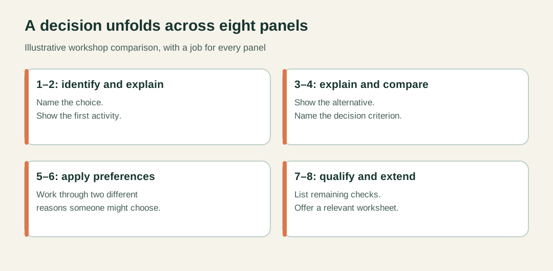
Original eight-panel teaching example. Panel count is not a platform recommendation.
Make the panels understandable at viewing size
Use readable text, explicit labels and descriptions that preserve the important meaning beyond the image.
Review the carousel on a phone at ordinary viewing size. Do not judge readability only from the enlarged design canvas. If the comparison requires tiny text, reduce the number of ideas on the panel or move a secondary detail into the accompanying caption. Shrinking every sentence is usually a sign that the scope needs attention.
Keep the hierarchy predictable. A panel heading should identify the point, while supporting text explains it. Decorative elements should not compete with labels that the reader needs to understand the comparison. Distinguish options with words as well as color.
Write useful text alternatives for meaningful images where the publishing interface supports them, and ensure the accompanying text communicates the core lesson. W3C's image guidance explains that alternatives depend on image purpose. A diagram comparing two processes needs different treatment from a decorative photograph.
For the storyboard, the caption can briefly restate the decision and the remaining checks. It should not merely say “swipe to learn more.” A person encountering the caption without fully interpreting every panel should still understand what the post covers and what it does not settle.
Ask a reviewer to explain the difference between the options after seeing the draft. If they remember the colors but cannot state the decision criterion, revise the content. This is a qualitative editorial check, not a measured accessibility certification or evidence of future engagement.
End with a next question you can actually support
Invite an action that follows from the lesson, and keep the resource promise aligned with what the reader will receive.
The natural next question in this example is not “How do I become a ceramic artist?” It is “What should I check before choosing a session?” A workshop comparison checklist can support that step by providing fields for duration, inclusions, location and questions to ask.
Describe the artifact concretely. “A blank comparison sheet with one completed example” is more informative than “the ultimate workshop guide.” If you use a comment-triggered delivery, the campaign examples and comment-to-DM setup guide explain the mechanics separately.
Before publication, compare the final panel with the actual resource. Does the file contain the comparison fields shown? Can someone use it without reading a sales page first? Are the public explanation and the download consistent about what remains uncertain?
After publication, read relevant questions for evidence that the teaching sequence needs improvement. Repeated confusion about the difference between activities may indicate that panels two and three need clearer demonstrations. Questions about dates belong to current availability information. Do not assume every response is a request for a longer carousel.
The post has done useful work when it helps a reader form a better question or make a better-informed choice. That outcome is more specific than making a carousel feel educational, and it gives the next revision a clear purpose.